
-
Fisher-Titus is an independent healthcare system that has cared for the communities of North Central Ohio since 1917. Their visual identity was transformed through a clean and intentional rebrand, including (this is where I come in) a modernized site design and experience, brand-new guidelines, and consistent consult with their internal marketing team. Elevating the quality, consistency, and usability for a diverse patient audience solidified this brand as a provider their community can trust— and client trust in our work.
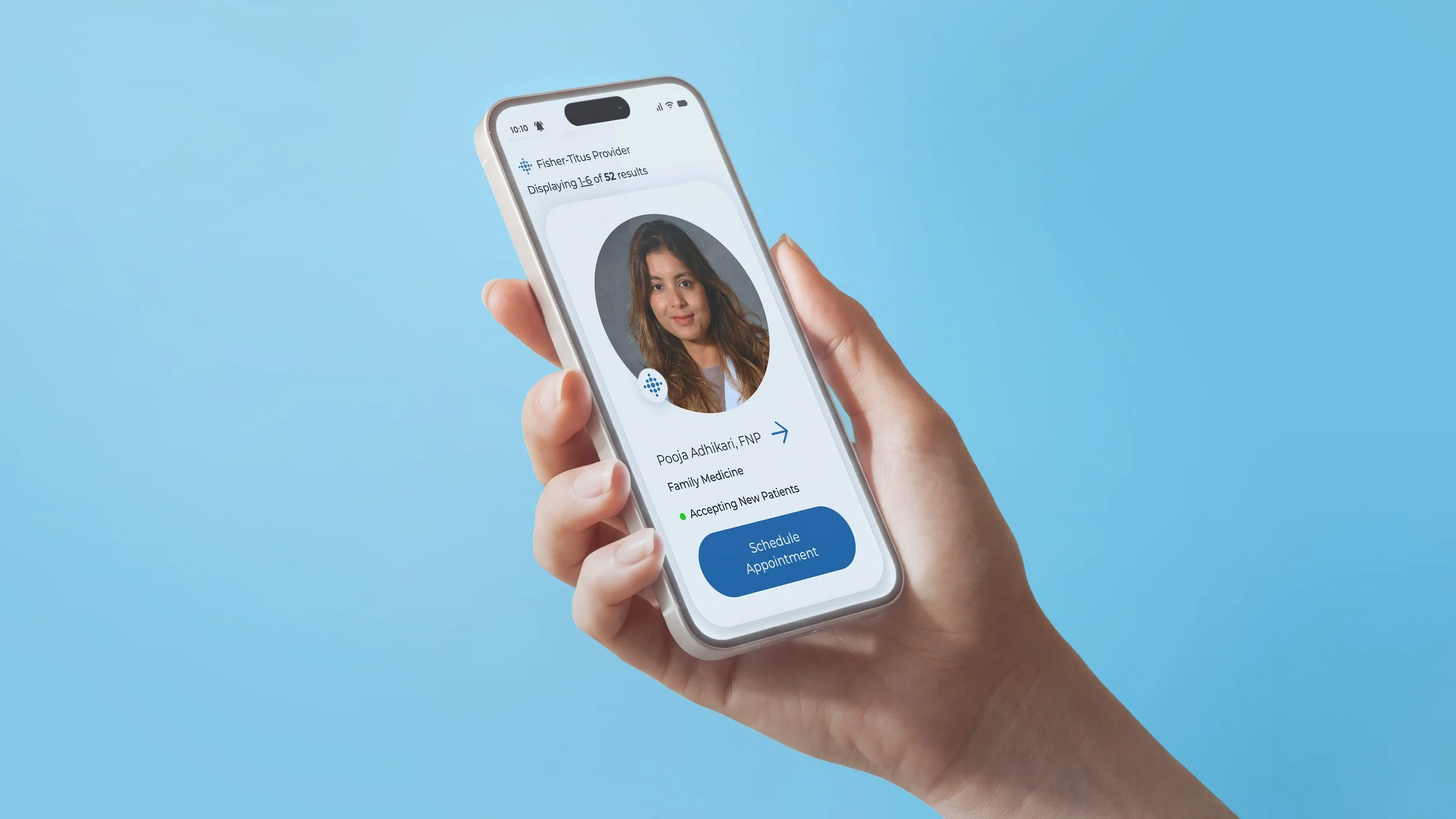
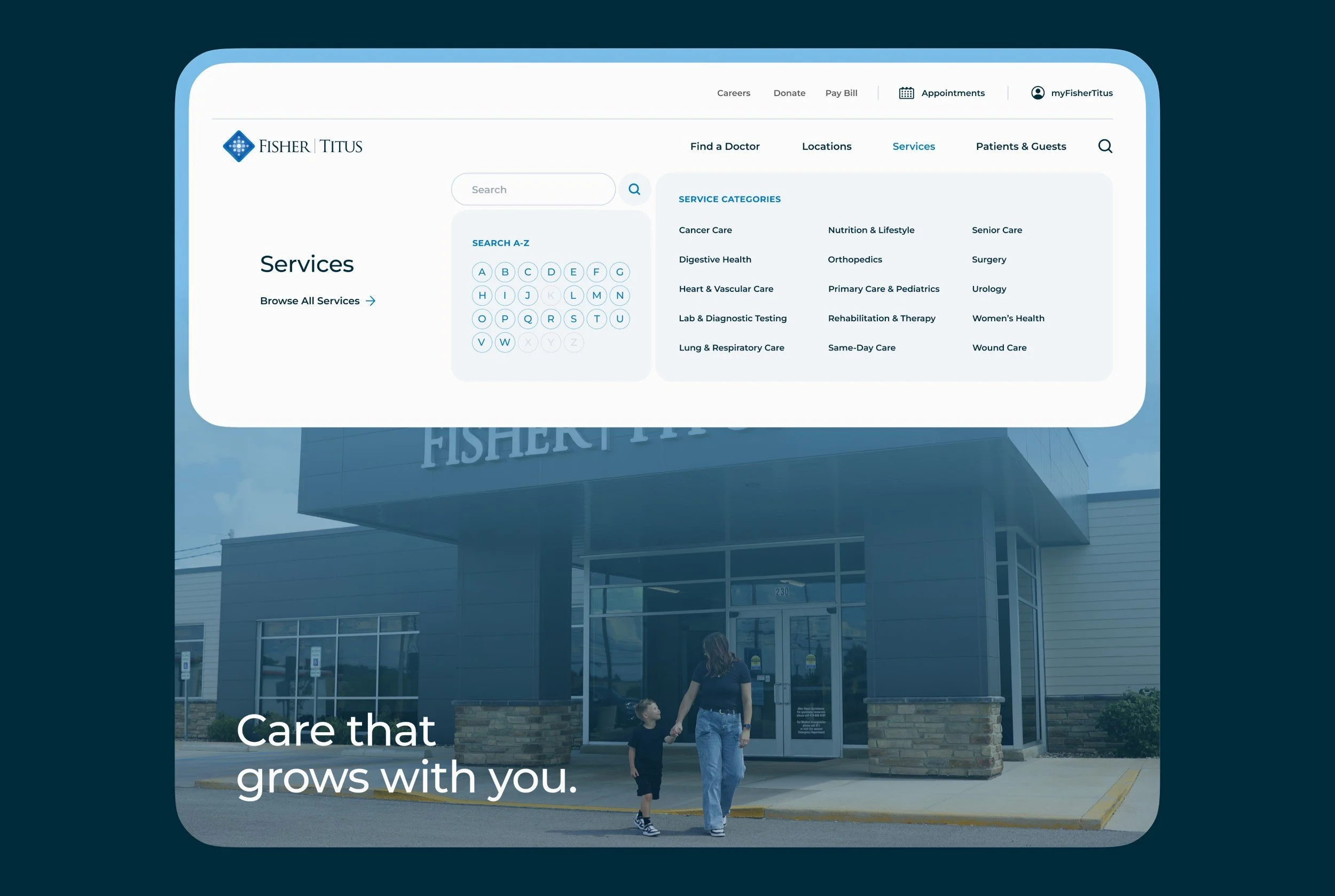
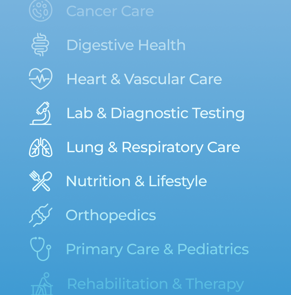
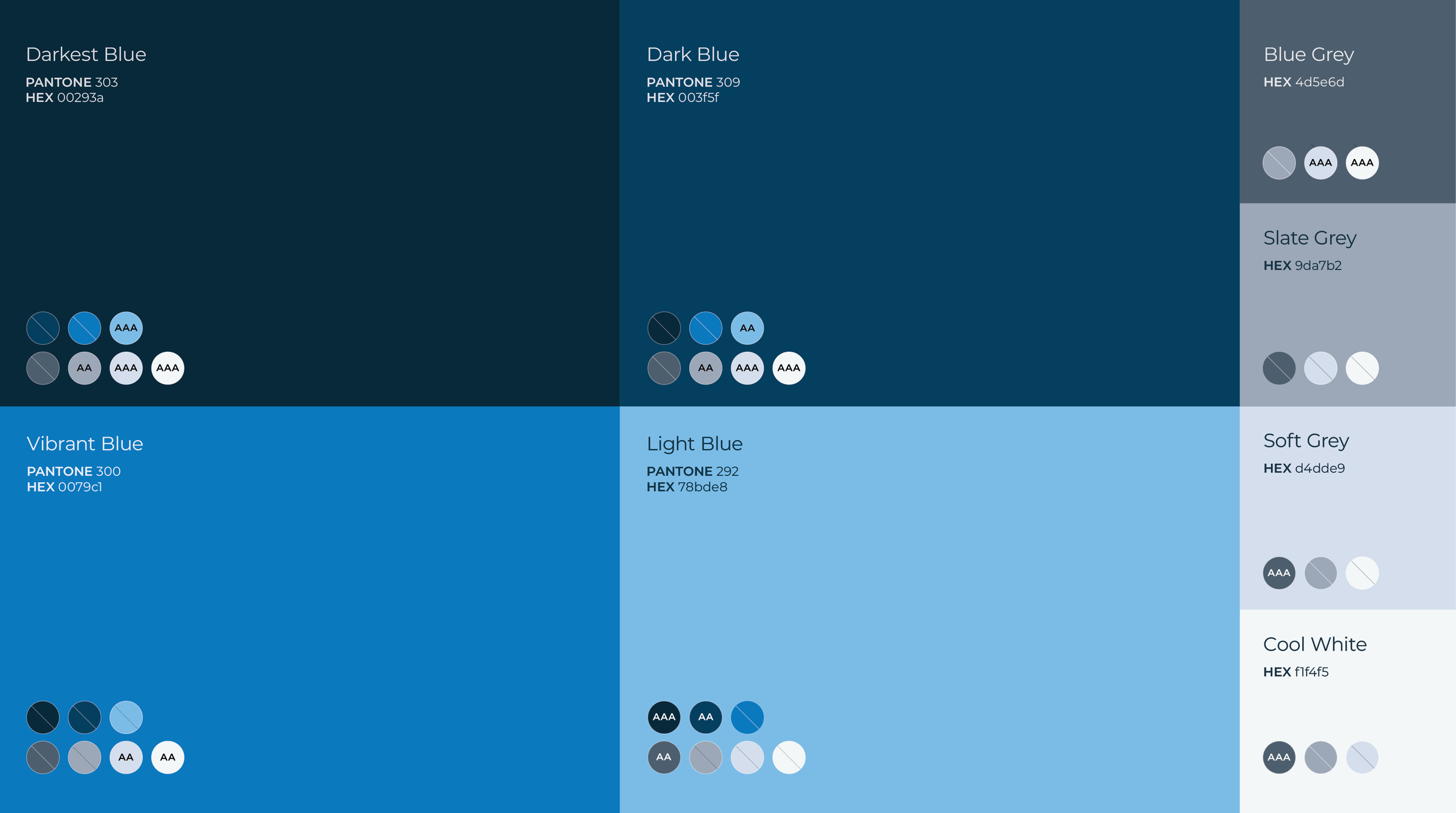
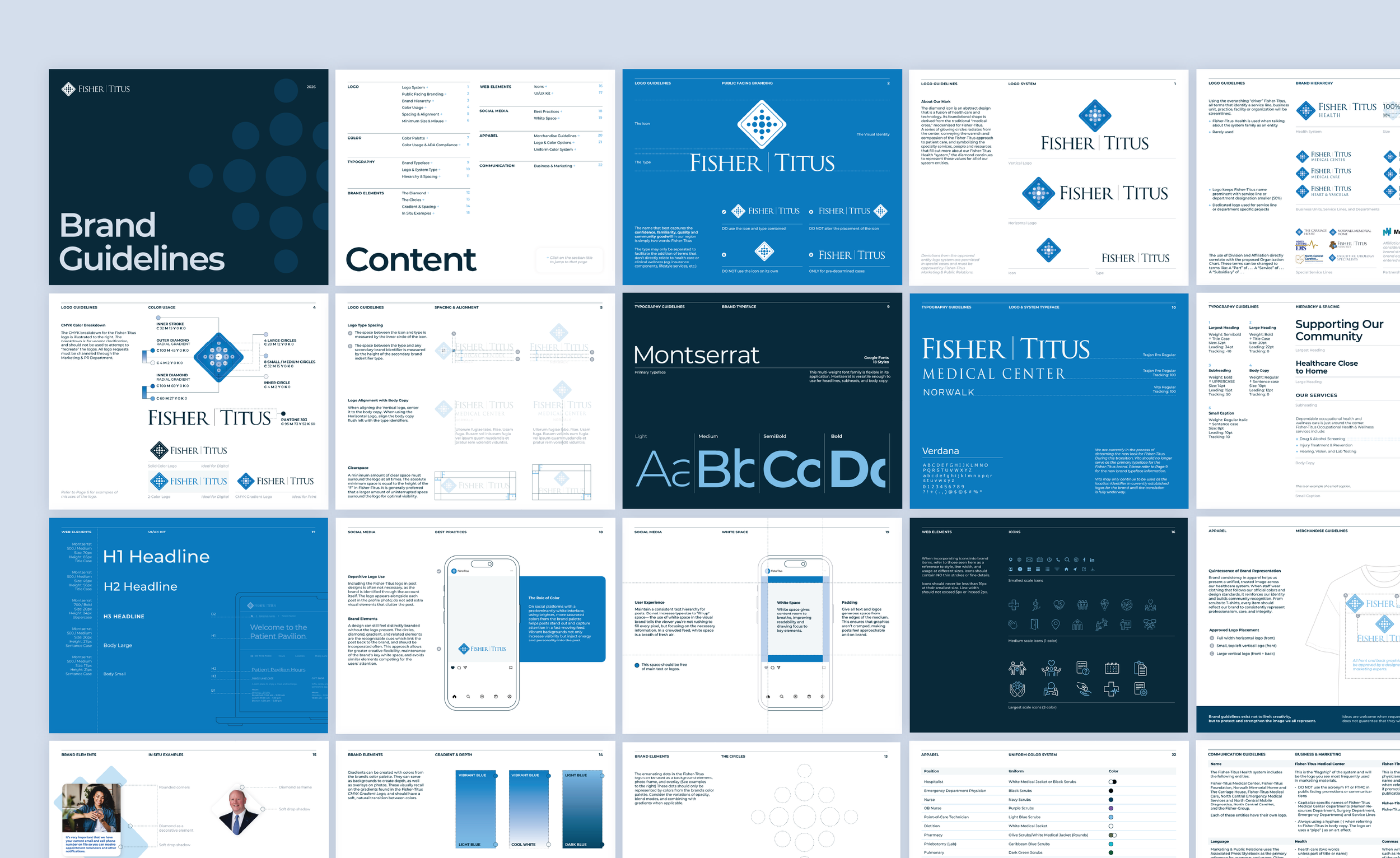
Building a foundation came first. The new brand guide now has an ADA-friendly color palette, intelligible typography, spacious design systems, and clear direction to keep the brand consistent in every marketing opportunity. This fresh, contemporary visual language led the site’s redesign, creating a clean space for users to navigate conveniently. No more going to Fisher-Titus just because you have to.
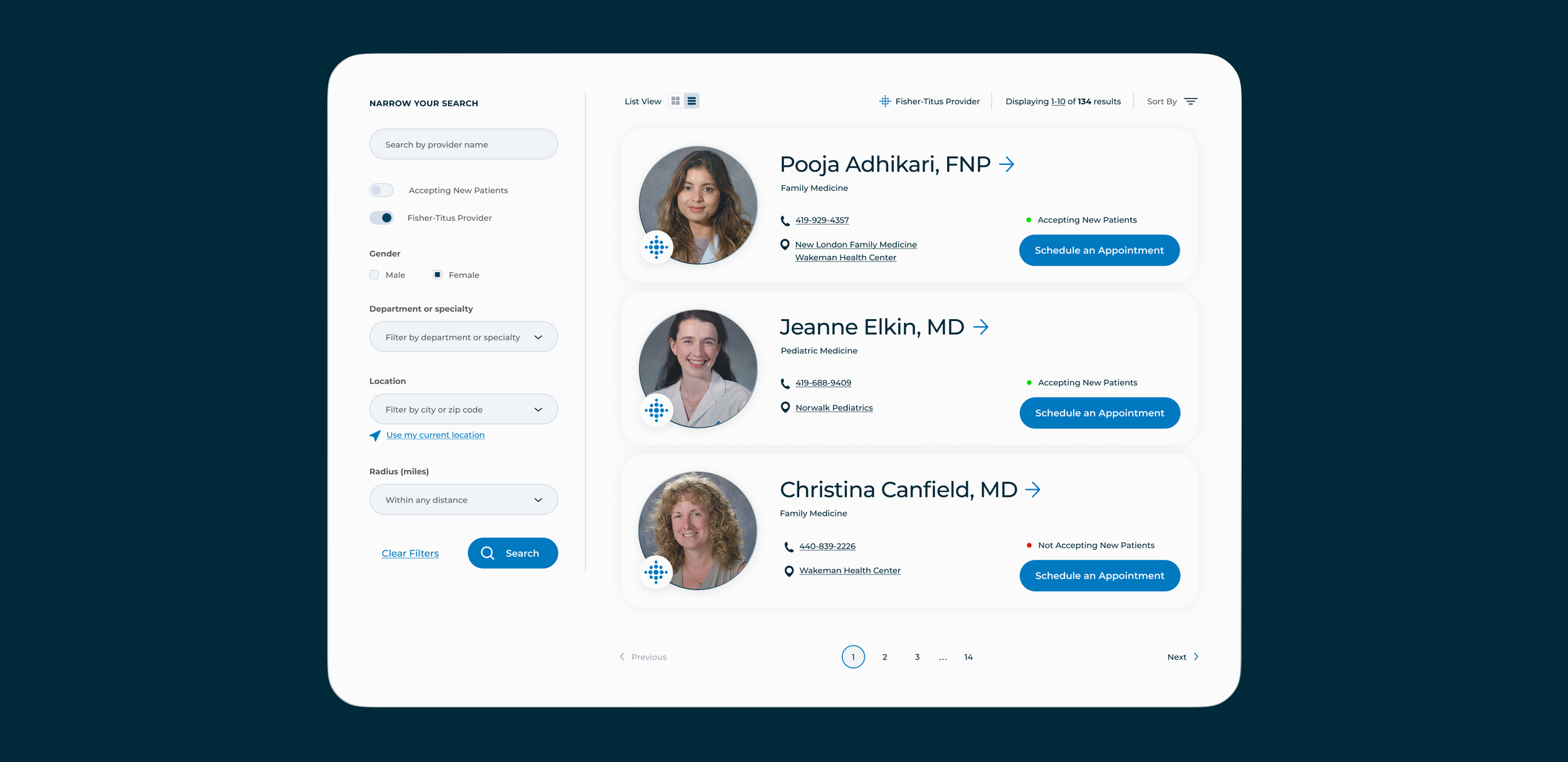
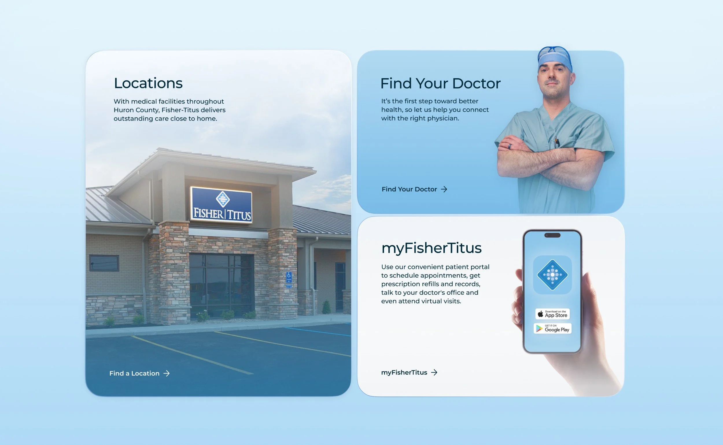
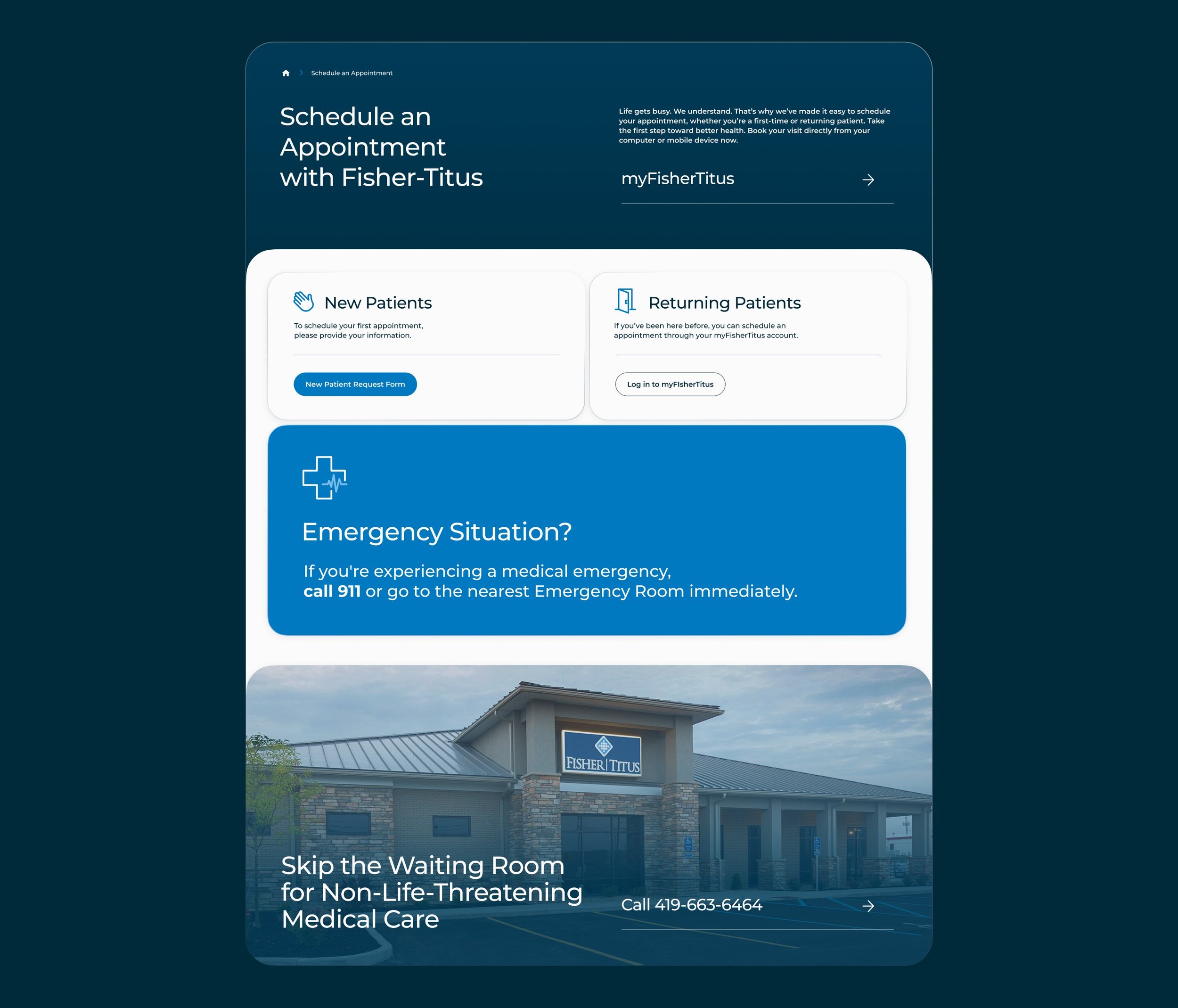
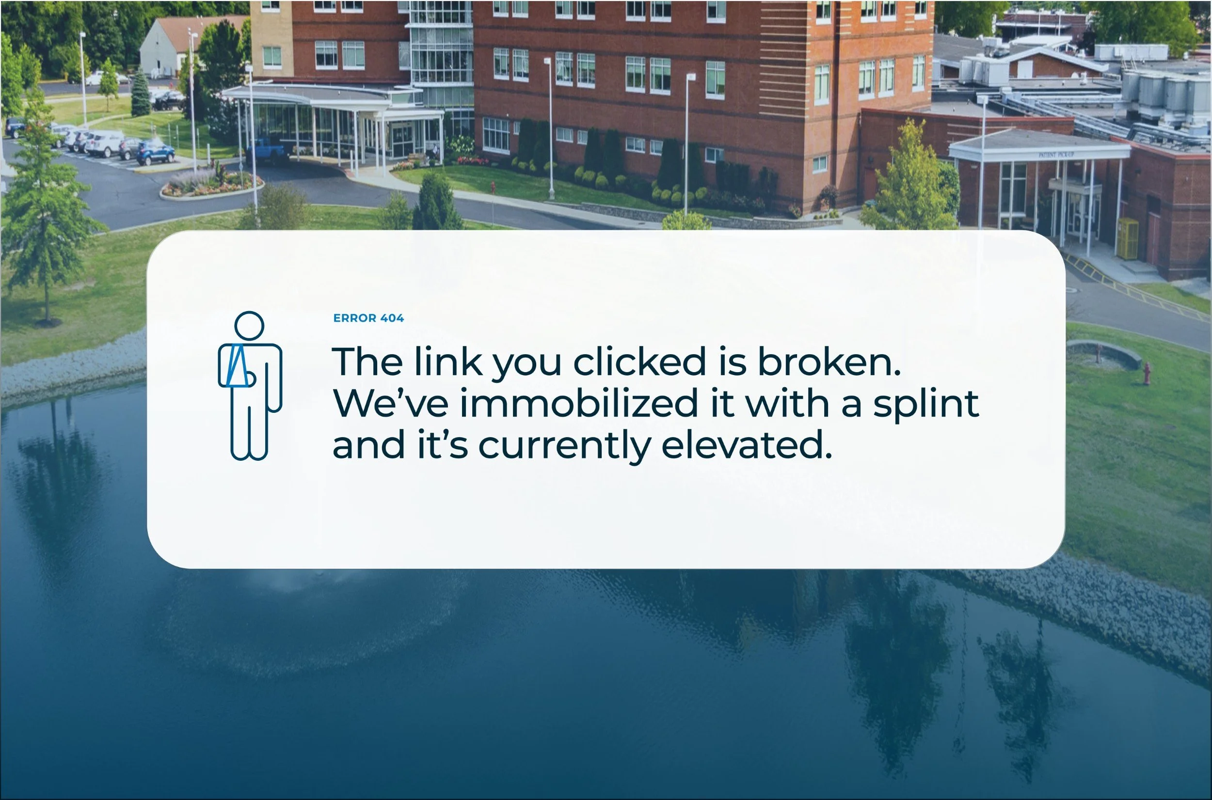
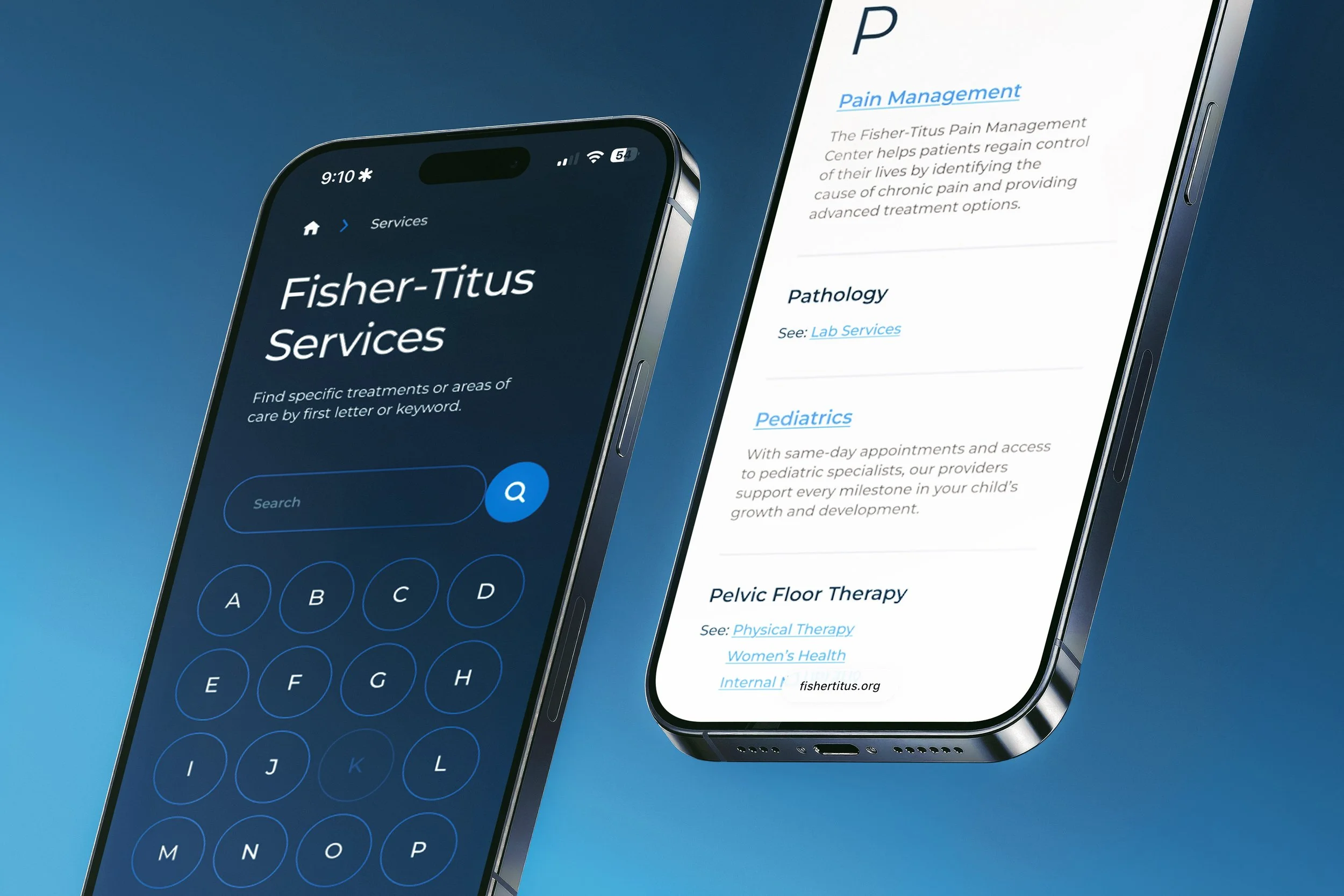
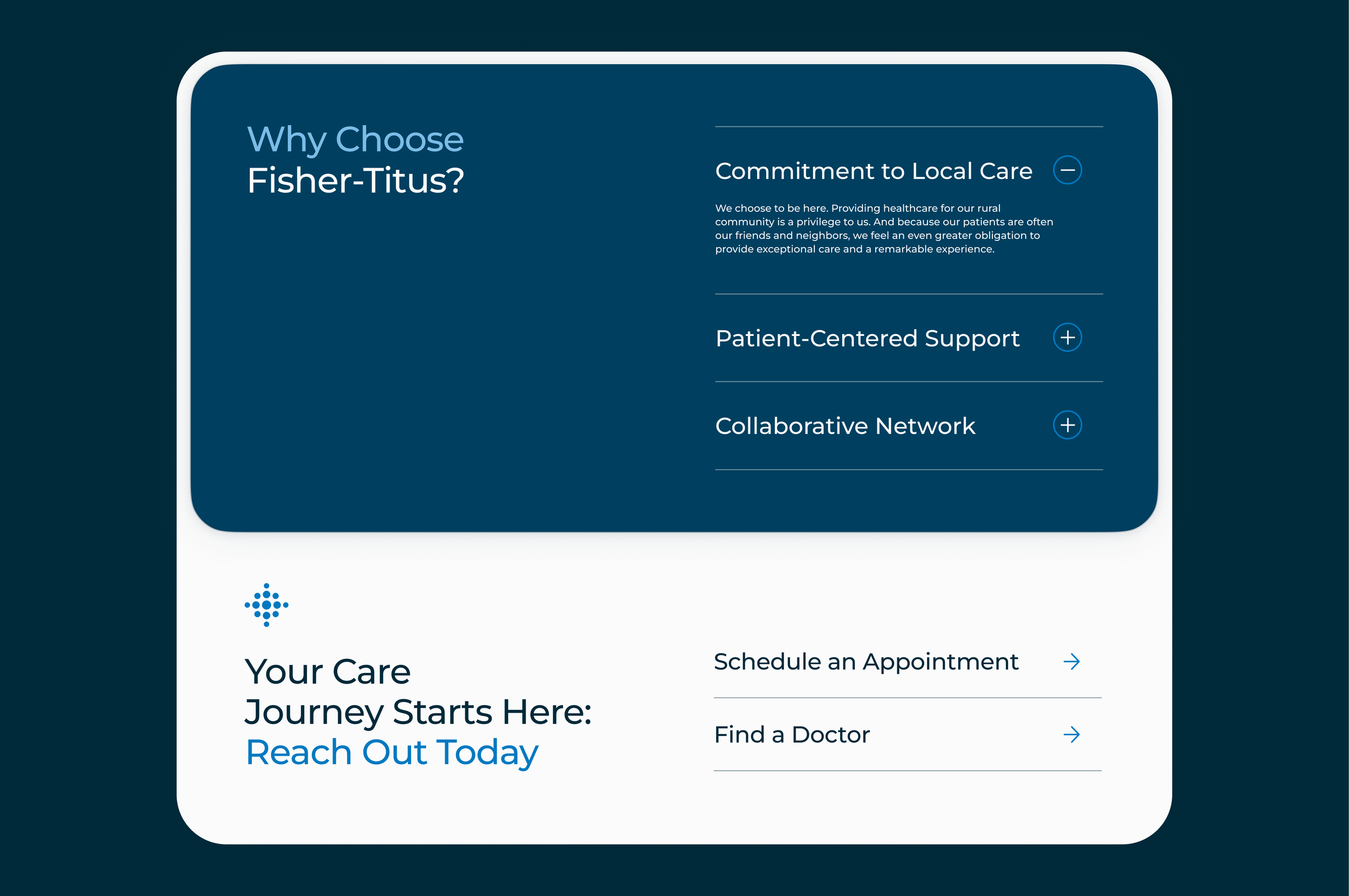
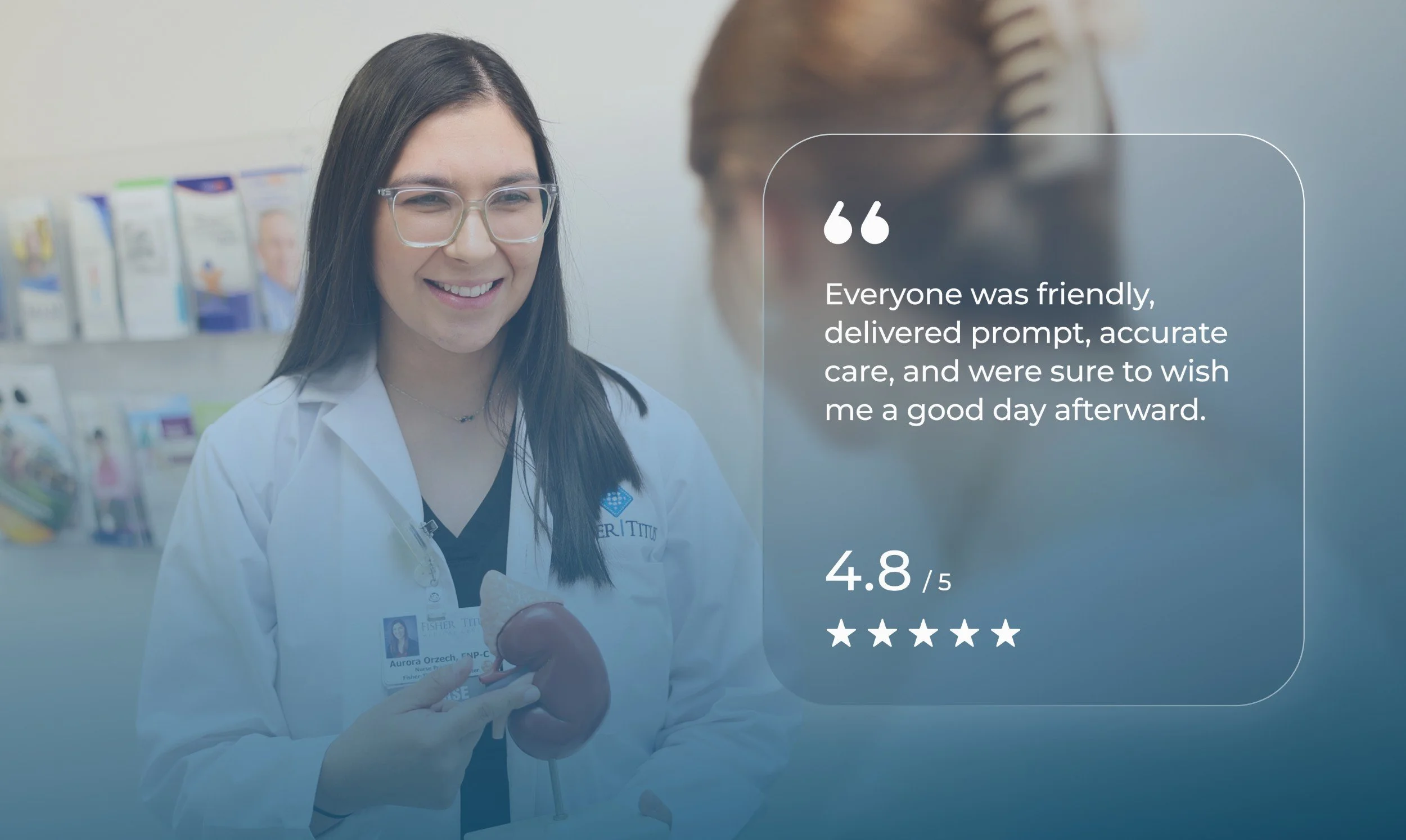
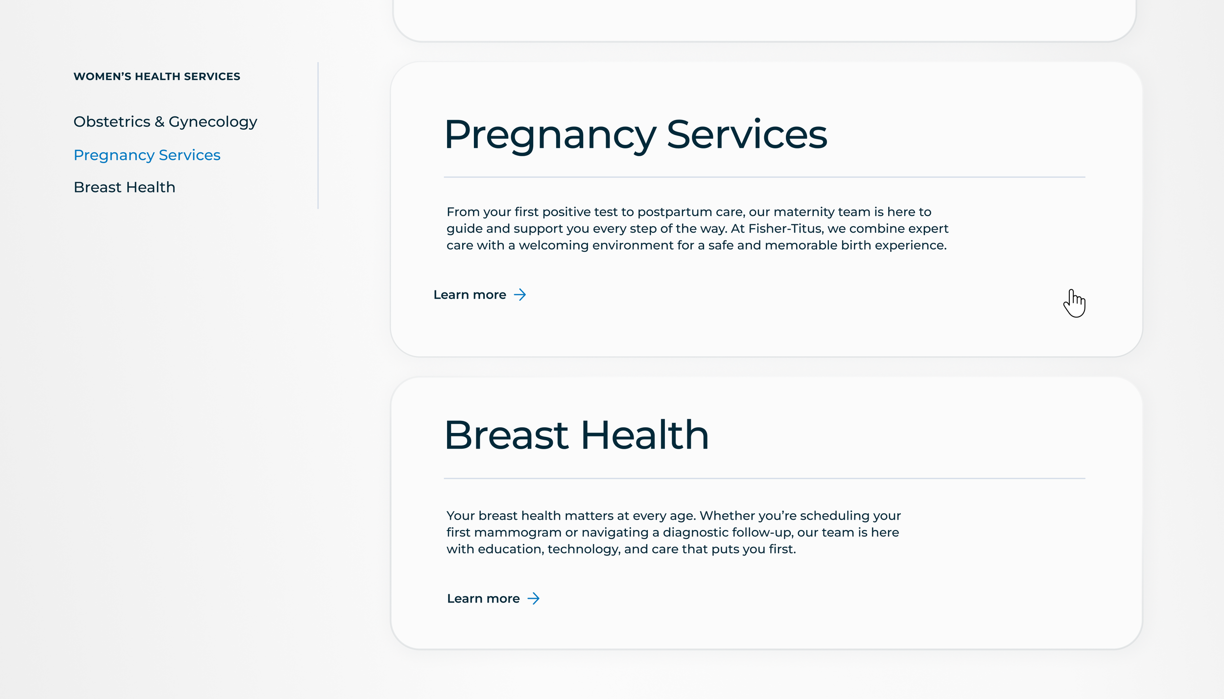
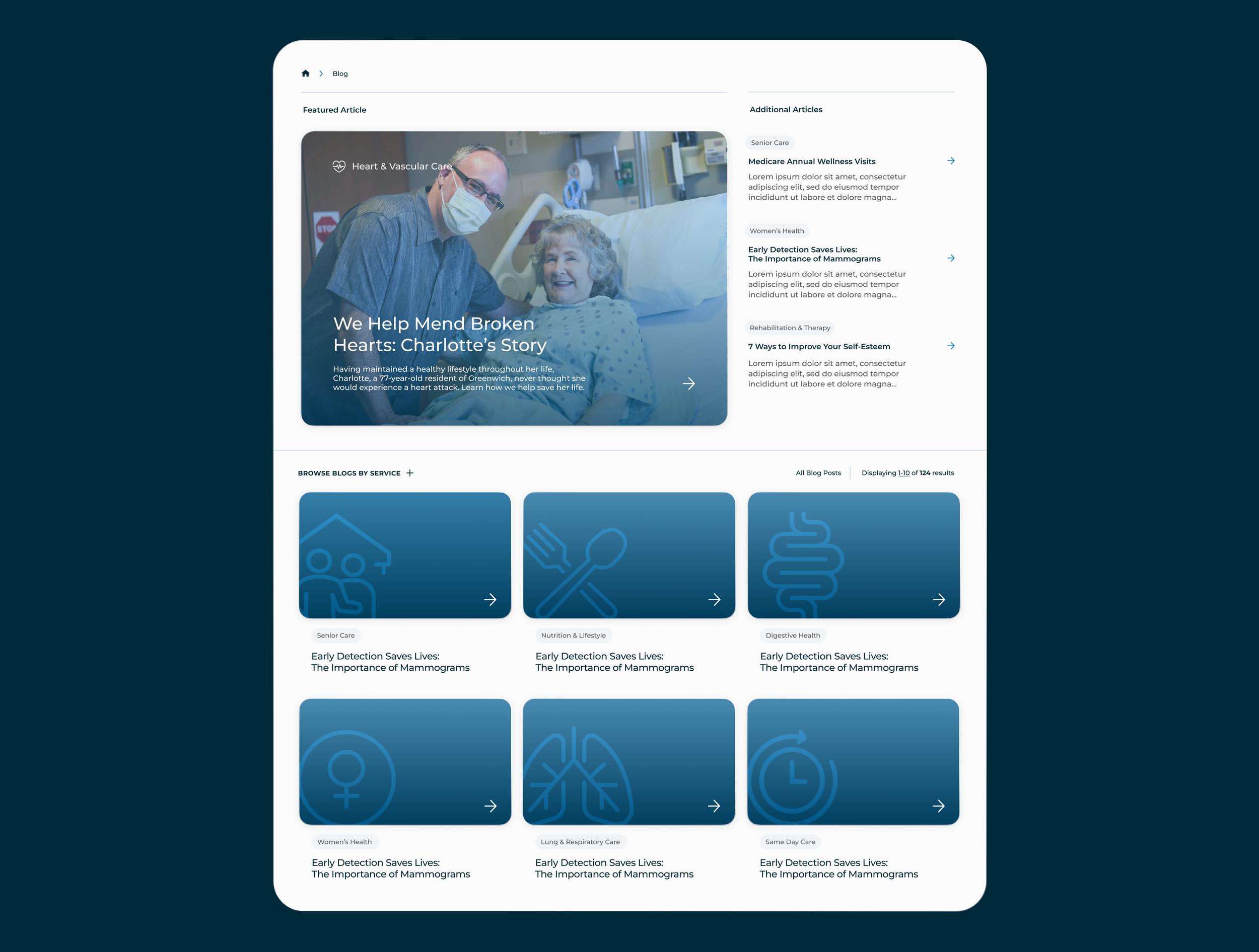
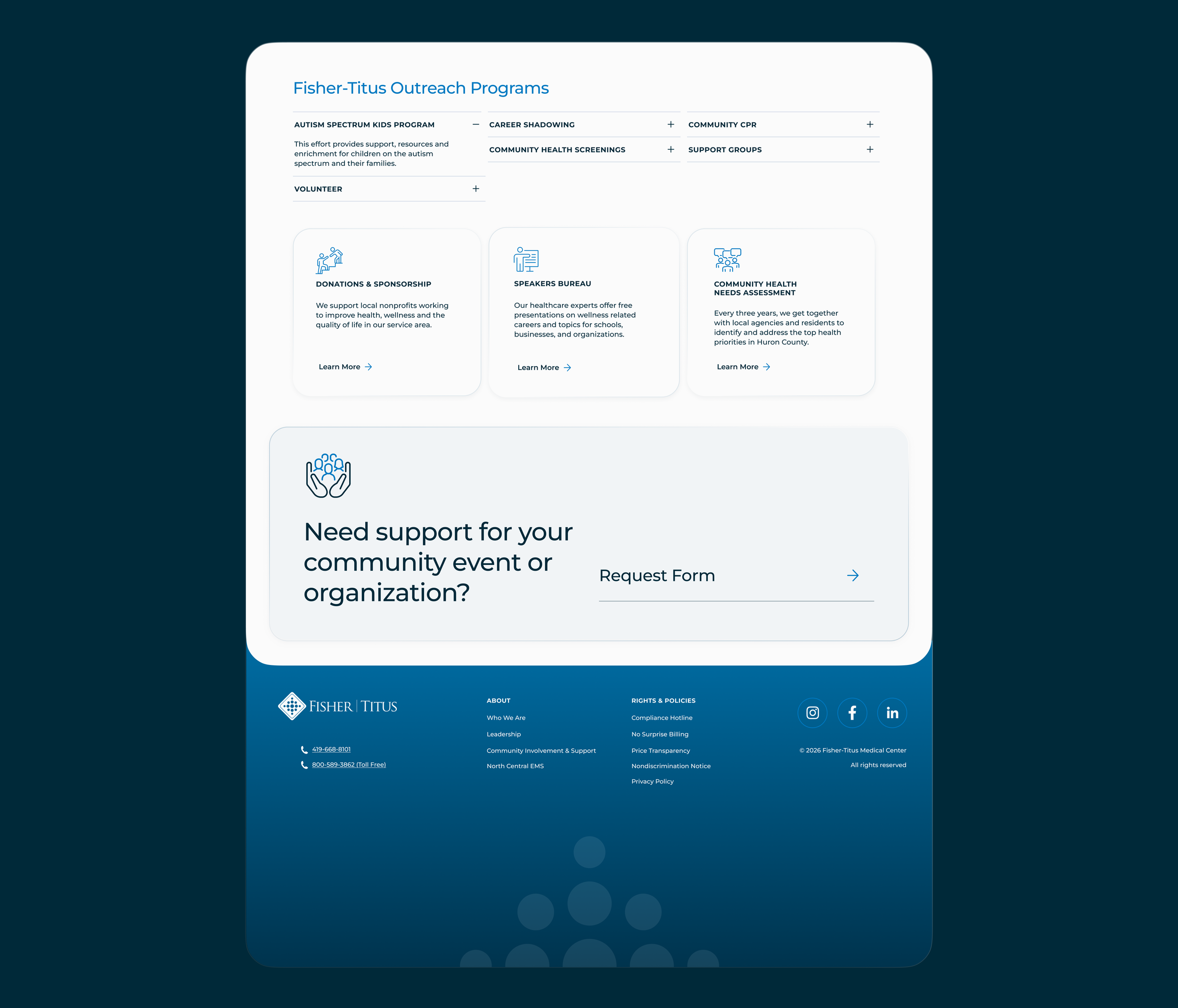
The site design prioritized ease of navigation, compliance, and top-end UI to reflect trustworthy quality care. It became the forefront of the brand’s new creative direction, and the modern practice can be seen in local billboards, quarterly ad campaigns across social media, Google display, and print materials.
Refresh & Brand Care for Fisher-Titus
Fisher-Titus is an independent healthcare system that has cared for the communities of North Central Ohio since 1917. Their visual identity was transformed through a clean and intentional rebrand, including (this is where I come in) a modernized site design and experience, brand-new guidelines, and consistent consult with their internal marketing team. Elevating the quality, consistency, and usability for a diverse patient audience solidified this brand as a provider their community can trust— and client trust in our work.
Building a foundation came first. The new brand guide now has an ADA-friendly color palette, intelligible typography, spacious design systems, and clear direction to keep the brand consistent in every marketing opportunity. This fresh, contemporary visual language led the site’s redesign, creating a clean space for users to navigate conveniently. No more going to Fisher-Titus just because you have to.
The site design prioritized ease of navigation, compliance, and top-end UI to reflect trustworthy quality care. It became the forefront of the brand’s new creative direction, and the modern practice can be seen in local billboards, ad campaigns across social media, Google display, and print materials.
Website design, refreshed brand identity & guidelines, social media, digital advertising, print & environmental media, consultationWebsite design, refreshed brand identity & guidelines, social media, digital advertising, print & environmental media, consultation©24-26







next project
mycrocine brand & development
Tonya Lloyd, Sr. Director of Compliance at Fisher-TitusClient work partnered with design2influenceSee this project as a featured case study from design2influence & TOUCHSTONEDIGITAL