🡦 Ink Drinkers Anonymous
Overview
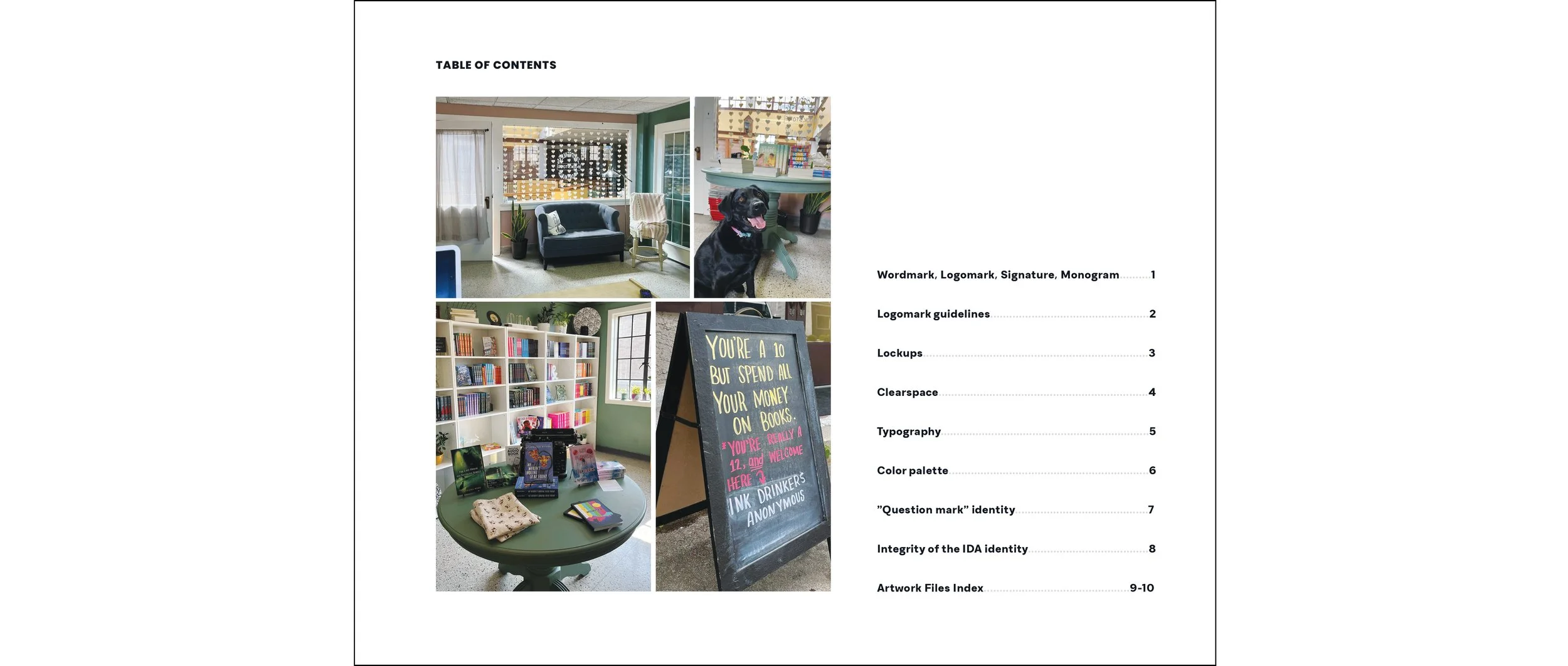
Ink Drinkers Anonymous is an independently owned bookstore in the downtown area of Muncie, Indiana. They believe everyone should have the opportunity to be celebrated, and keep a lovely inventory of books written by BIPOC and indie authors.
Genres include romance, thriller, horror, fantasy, and mystery for both YA and general fiction book lovers.
Programs
Adobe Illustrator, Photoshop, and InDesign

🡦 Branding


Preliminary Moodboard
Sketches

Previous Logo

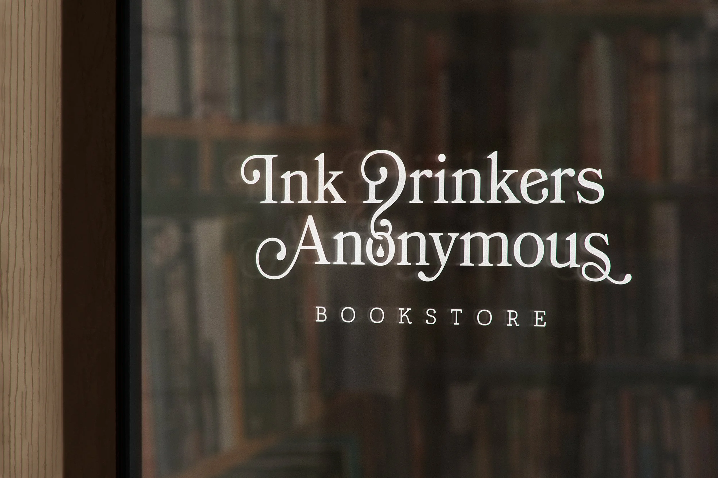
Redesigned Primary Logo

Seal (signature + logomark)
Monogram (wordmark + logomark)
Logomark
Logo Clearspace
Typography
Serif typeface chosen for its timeless, "bookish" feel. It was originally inspired by Bookman Old Style, a typeface often used as body copy in old books for its easy readability. It comes with a variety of decorative swashes used in the wordmark and in developing the logomark.
Serif typeface, also inspired by Bookman Old Style, combined with handwritten elements. It’s used in this identity uppercase with 600 pt tracking. Created from the same inspiration as Bookmania, these typefaces complement each other and the idea of a bookstore very well.
Another serif typeface that was chosen for its antique approach to body text and timeless look, similar to Bookmania.

Wordmark

Signature

Body Copy

Core Color Palette
Secondary Color Palette


Ink Drinkers Anonymous Brand Guidelines
🡦 Merchandising
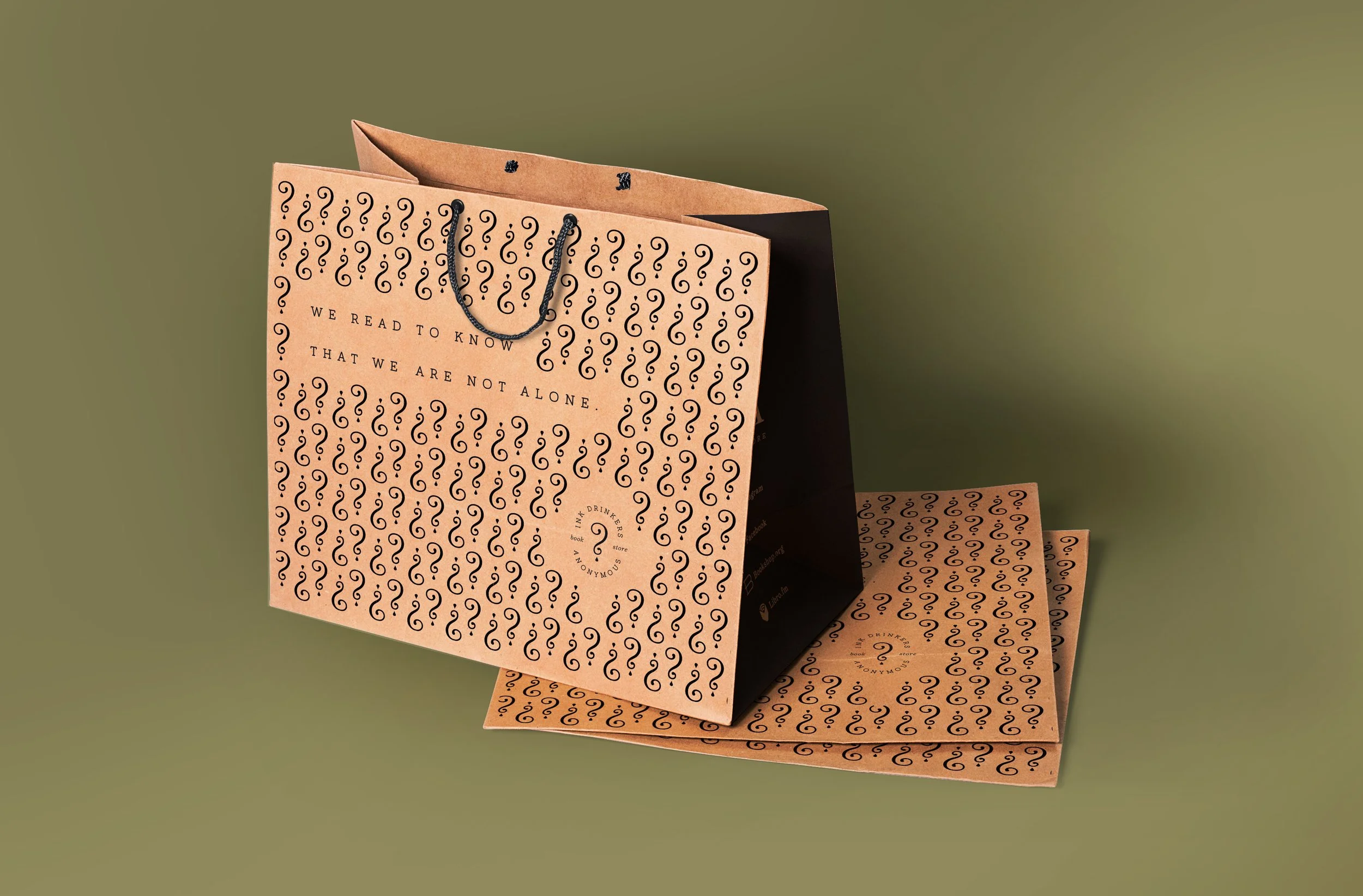
“Question Mark” Identity
To further expand on the identity in an effort to build brand recognition and connect with consumers, the logomark is morphed into a series of illustrations representing the genres sold by the bookstore. This is used for merchandise as well as navigation in the bookstore when searching for books by genre.